
The Palette: Notes on Building Colors to Create Storytelling in Imagery
There is a quiet, specific magic that happens in the studio during the first few minutes of a session. It’s the moment the light catches the fabric of a client’s dress, or the way a sharp blazer stands out against the soft curves of our Cyclorama Wall. At Von Creative, we often talk about the "bones" of a shoot: the lighting, the equipment, the 40-foot wide space: but the soul of the image often comes down to the palette.
Choosing what to wear for a studio session is more than a matter of fashion; it is a study in color science. It is about how a hue interacts with the environment to evoke a specific memory, a feeling, or a statement. When you step into our 2,000-square-foot space in Richlands, you aren't just stepping into a room; you're entering a curated landscape where color dictates the narrative.
The Intentionality of Mood
Every color carries a weight. Before you pull a single hanger from your closet or browse our Client Closet, it helps to ask: What story am I telling today?
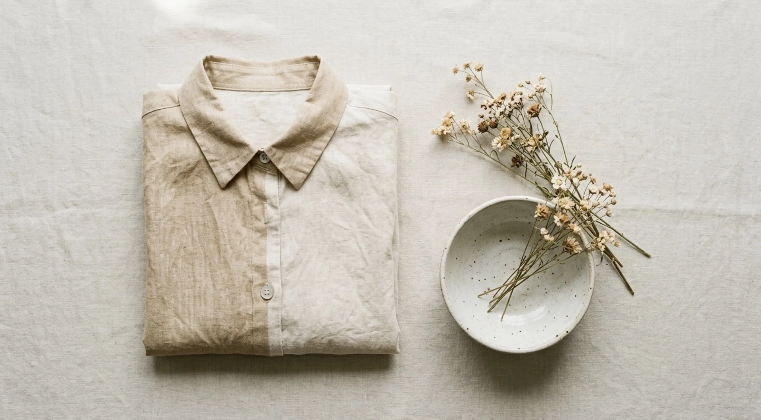
Color science tells us that neutrals: the creams, the stones, the warm oaks: invite a sense of calm and organic connection. They allow the human element, the expression and the gesture, to take center stage. Conversely, a saturated red or a deep peacock blue can transform a portrait into something architectural and bold. Intentionality is the bridge between a simple photo and a piece of art.
Harmonizing with 'The Bed'
Our current Current Sets include "The Bed," a space designed for softness. It is a sanctuary of white linens and an ethereal floral installation that hangs overhead like a blooming canopy.
When styling for this set, we often recommend a palette of whispers. Think of "The Bed" as a high-key environment. Wearing ivory, pale sage, or dusty rose creates a monochromatic harmony that feels timeless. The goal here is to let the textures of your clothing: a silk slip dress or a chunky knit sweater: blend into the softness of the florals. This approach results in images that feel airy, light-filled, and quietly romantic.
The Presence of 'The Peacock Chair'
On the other end of the spectrum sits "The Peacock Chair,” an artisan set designed by the incredible Shots Fired Photo Stylings. This set is more than just a place to sit; it is a collaboration of textures and light, a quiet conversation between a bold terracotta canvas and the artful florals that frame it. It is "museum-worthy" by design and demands a certain presence that rewards those who understand the dialogue between their subject and the space. Choosing the right palette is essential — you’ll want them to stand out, yet belong: to be the focal point of a larger, living piece of art.
Our top picks:
The High End Neutral: Cream or Crisp White — There is something inherently sophisticated about the combination of white and warm earth tones. A crisp white linen or a soft cream knit acts as a clean canvas within the frame allowing the colorful florals to pop and the intricate weave of the rattan chair to show its detail without any visual competition.
The Complimentary Contrast: Deep Teal or Forest Green — If you’re looking to make a subject truly "pop," we lean into the science of color. On the color wheel, blue-greens are the natural soulmates to orange and terracotta. Deep teal or a rich forest green creates a striking contrast that draws the eye directly to the subject. This choice also does something wonderful for the composition: it picks up the deep greens of the floral stems and foliage. It creates a visual bridge between the person in the chair and the environment surrounding them. It feels intentional, balanced, and deeply cinematic.
The Editorial Story: Monochromatic Earth Tones — For those who love a "tone-on-tone" aesthetic, lean into the warmth. Think rust, mustard yellow, or a deep chocolate brown. When your subject wears colors that reside in the same family as the backdrop, the image becomes less about contrast and more about texture and mood. This approach creates a very specific, curated "editorial" feel. It’s the kind of photography that feels like it belongs in the pages of a high-fashion archive: where the subject is an extension of the space itself. It’s warm, inviting, and incredibly cohesive.
The Museum Presence: Classic Black — Finally, we cannot overlook the power of black. In a set that feels "museum-worthy," a sleek black dress or a well-tailored suit provides a grounded, powerful silhouette. Black absorbs the light in a way that emphasizes the subject's form against the vibrant, light-reflecting terracotta. It is sophisticated. It is timeless. It turns the entire session into a series of striking portraits that feel heavy with intention. If you want the "Peacock Chair" to feel like a throne, black is the undisputed choice.
Our don’ts
Prints — While we love a good print, The Peacock Chair is already a star when it comes to pattern. Between the intricate rattan and the artful florals, there is a lot of visual information for the eye to process. Our pro-tip? Steer clear of busy patterns that might compete with the set. Instead, focus on texture. A silk slip dress, a heavy linen shirt, or a soft velvet blazer will photograph like a dream. They catch the light, add depth, and allow the "museum-worthy" design of the set to shine alongside your subject.
The Infinite Canvas: The Cyclorama Wall
The Cyclorama Wall is where color theory really shines in its purest form. Because it is a seamless, white "infinite" space, it reflects everything you bring into it.
High-Fashion Drama: Choose one primary color: a vivid red, a electric blue: to create a striking focal point. Without the distraction of a background, the color becomes the subject.
Modern Monochromatic: Layering different shades of the same color (for example, a charcoal coat over a slate grey shirt) creates a sophisticated, editorial depth that looks incredibly high-end.
The Cyc Wall is the perfect place to experiment with how light bounces off different colors. Darker tones will absorb the light, creating a moodier, more grounded look, while lighter tones will reflect it, making the skin glow.
The Weathered Portico
Gorgeous red and pink roses paired with mauve draping and distressed iron chairs, these are the color palettes we’re loving:
The "Tonal Dream" (Mauve & Dusty Rose): Leaning into the colors already in the set creates a soft, monochromatic look that feels incredibly high-end. It’s very "editorial" and lets the textures of the fabric do the talking.
The "Clean Canvas" (Ivory & Champagne): You can never go wrong with a crisp cream or champagne. It provides a stunning contrast that lets those vibrant red roses really pop without making the frame feel too busy.
The "Timeless Silhouette" (Classic Black): If you want to lean into the moodier, vintage side of this set, a sleek black outfit creates a powerful silhouette. It grounds the whimsical florals and feels very "sophisticated noir."
Texture as a Silent Color
While we focus on hue, texture acts as the "value" of your color. In a studio environment, how a fabric interacts with our professional lighting is just as important as the color itself.
Matte Fabrics: Cotton, linen, and wool absorb light, giving a soft, approachable feel. These are perfect for lifestyle sessions or family portraits.
Reflective Fabrics: Silk, satin, and sequins catch the light, creating "specular highlights" that add a sense of luxury and movement.
Structure: Heavy denim or structured blazers create clean lines and shadows that emphasize the architecture of the body.
When you mix textures: say, a silk skirt with a heavy wool sweater: you create visual interest even if the entire outfit is a single color. It’s a subtle way to add "color" without changing the palette.
A Recap of the Palette
Start with Intent: Choose colors based on the emotion you want to convey.
Harmonize with Neutrals: Use pastels and whites for sets like "The Bed" to achieve a timeless, ethereal look.
Embrace Contrast: Use bold, complementary tones for statement sets like "The Peacock Chair."
The Cyc Wall as a Blank Slate: Lean into monochromatic layers or high-fashion pops of color.
Don't Forget Texture: Use fabric to influence how the studio light moves across your silhouette.
Designing your session is a collaborative process between your vision and our space. We invite you to browse our Inventory System to see how our 900+ items can complement your chosen palette. Whether you’re planning a branding shoot or a creative editorial, we’ve built this studio to be the perfect canvas for your color story.
Capture Your Vision
Are you ready to bring your palette to life? Whether you need the soft romance of our floral sets or the clean lines of our cyclorama wall, the studio is waiting for you.